
Catching Up and Citizenship!
Time keeps flying by, as it does. I wanted to do a little update to let you know what I’ve…
A Love of Nature, Place and Story
Time keeps flying by, as it does. I wanted to do a little update to let you know what I’ve…

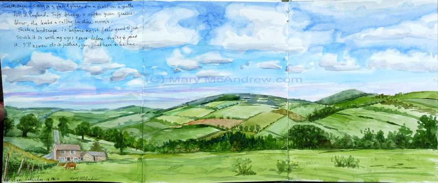
When we lived in Northumberland I’ll never forget the first time I saw the wild goats in the Cheviot hills.…
(Click on any picture to see it enlarged) I did this study back at the end of December, the sketch…

Many studies in watercolor with a touch of gouache. I show my color notes next to each mushroom.

(Click photos to see enlarged view) This post has a lot of photos showing as many stages of painting as…
This is a very short post just to share a quick pencil study I did on March 2, 2023. We…

Another adventure into the snowy, cold back garden! I sketched this scene on January 17, 2023 then worked on the…

On January 16, 2023, I spent time just wandering around the garden, taking pictures of the snow on all the…

Sketching some grass outside in the snow. I show my field painting kit, bag, palette, sketchbook, and link to a video I did too. I talk about fox tracks in the snow.

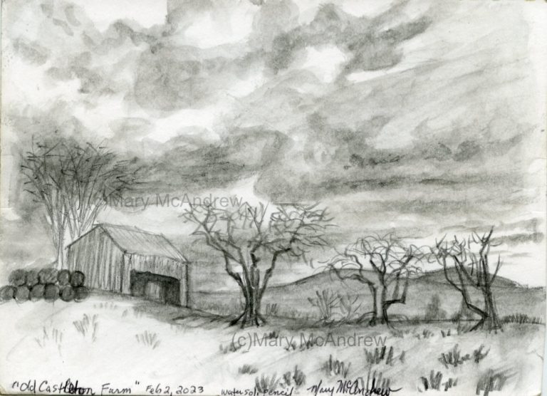
Gary and I went out for a quick drive in mid February even though it was overcast and cold. We…

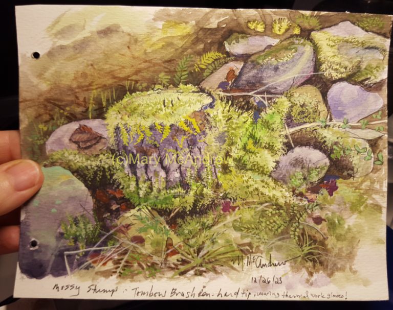
Painting autumn scenes using gouache paint, with moss, ferns and rock walls.

Since moving to our new home here in the Scottish Borders, we’ve been graced with the presence of hares in…